Here’s How You’re Most Likely To Die
An interactive chart reveals common causes of death broken down by gender and race.

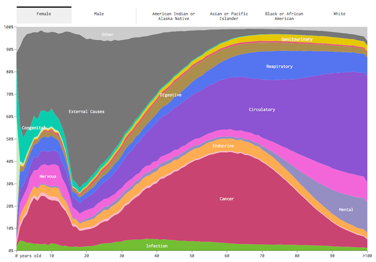
According to an interactive chart created by Flowing Data using information culled from The Center For Disease Control and Prevention (CDC), 40% of all women who died at the age of 60 did so because of cancer. For men under 40, the most likely cause of death is external, as opposed to some sort of disease or internal failure.

While far from perfect — the creators of the chart admit that in certain instances, such as Native Americans, the sample sizes are just too small — the chart does provide some interesting data to chew on. Another example: Only 3% of men die from mental or behavioral disorders, while the number is closer to 6% for women (and both see a rise in the likelihood after the age of 70). Surprisingly, the highest rates of cancer deaths are among Asian or Pacific islanders, at 28%.
Naturally, some causes of death tend to rise up and be much more common than others. According to the chart, a third of people die from diseases of the respiratory system like the flu, but less than 3% die from infectious or parasitic diseases like Tuberculosis.
The chart allows you to isolate causes, and filter results through gender or ethnicity.
[via FlowingData.com]
- All The Information You Need To Share About...It’s incredibly sad to think of our pets without us, but here’s your chance...Read more
- Estate Planning For Your PetsAmerica is approaching a belly rub crisis. Or, in the case of cats, that...Read more
- What To Say To Someone Grieving The Loss Of A PetFor most people, it’s not just a dog, cat, or other domesticated animal....Read more
- Planuary: Organizing For The New YearIf the turn of a new year inspires you to finally get your life in order, we...Read more


